Tuesday, February 08, 2011

miscellany: colored pencils, children's books

The CPSA Explore This!7 entries and winners are now online, here.


And the prospectus for the next International Exhibition is here. The deadline is March 31st! Not sure if I will enter this year, but we'll see.

~~~~~~

I just got myself caught up on what happened at the SCBWI Winter Conference, here, on the Official conference blog.
Fun reading!


~~~~~~~

That's all for today. I have to go brave the WIND and get the car smog checked. Life is fun.

Sunday, February 06, 2011

Illustration Friday - "Reverse"

"Looking back" is the same as going in Reverse, right? Well, close enough.

(click to see it a little bigger)

I'm looking in Reverse at some art I did a while back. This was for Highlights. Its also sort of my lame nod to the party atmosphere in the air here in the US today for the Superbowl, which I have absolutely no molecules of enthusiasm for whatsoever. I don't even know who's playing. (Should I not admit that?) I do love the commercials, but will probably watch them all on YouTube tomorrow.

Anyways. This was a Hidden Picture. I can't offhand remember what the hidden objects were, but looking at this I can spot: bowling pin, saw, horseshoe, closed book, rowboat, bone, camera (it has a little strap hanging off of it), and there should be one more, since there are usually 8 things, but can I find it? No. All you Hidden Picture veterans have a good look and tell me if you see anything else, will ya?

This was done in ink and watercolor, and I'm thinking this would be a good piece to practice on to try and do digitally. Maybe with Painter? I'm still determined to get a digital portfolio of children's book pieces together, in a simple style.

But meanwhile, WHAT IS THE 8TH HIDDEN THING?

** Update - I found it! Its a tomato. See the image below for all the 'erased out' objects.
Thanks for playing!

Thursday, February 03, 2011

Chinese New Year

Gung Hay Fat Choy! or Kung Hei Fat Choy! depending on how you want to spell it, English-style. Sorry I don't know the actual Chinese characters to use. Even then, it depends on what dialect you're speaking. I think what I've done is Cantonese, in English.


Its the year of the Rabbit. I know that Carrot Cake is not a traditional Chinese dish, but at least my heart is in the right place. Eat something yummy and think about good fortune and health and all of that, right?

So happy Year of the Rabbit everyone! Let's hope it is a happy year. The last one - not so much.

Monday, January 31, 2011

Some things change, some don't

I ran across this piece I did from a while back, and had a good laugh.

(click on it to see it bigger)

Check out the guy's cell phone. It has an antennae.
But of course the bratty kid with the 'over it' Mom is something that will never change.


Bored people in line waiting to use the copier. Yep.
An annoying old lady poking the guy ahead of her - why? To go faster? To ask a question?


A creepy clown guy and the girl next to him, trying to keep her distance.


What I think is fun is that you could dress these people in old-timey clothes and put them in an old-timey setting, or do them all up "futuristic", and the people themselves would still be the same.

Friday, January 28, 2011

Gouache, with colored pencils

I decided to put this on ebay.
CLICK HERE TO BID

tube of gouache, 5 x 7, Luminance on board

I'm still trying to fall in love with the Luminance pencils. I'm getting there. I used a wee bit of Cassel Earth on this and found it to be dry and that irritated me, but the other colors were fine. Mostly this is white and buff and a few blues and greys and violets.

I just plunked the tube of paint down on a wadded up paper towel, so it ended up being a 'white on white' composition. Then I picked out a scrap of olive greenish matt board, so I could practice doing light on dark. I used to do this well with pastels, but colored pencils behave differently. I've always liked olive for a background color. Its a good neutral - or at least, it works for me.


I'm getting tired of doing photo-real stuff. I still like it, I'm just tired of doing it. This is more satisfying to me right now. I like to draw like I have a brush in my hand - except that its a pencil. Does that make sense?

OK, that's all for now. Carry on.

Wednesday, January 26, 2011

New tricks

(I left out the 'old dog' part of that)

OK. This whole digital apps and ebooks thing is taking off like wildfire! And for an illustrator it could be a very creatively exciting (definitely) and financially lucrative (hopefully) thing. There are new blogs and sites that are all about how to do this popping up every day. Its the future. Its here NOW!


This is not my art. It was done by Stacey Williams-Ng for her book Astrojammies, available as an interactive picturebook for the ipad.


Demibooks is the company responsible for working with her to develop the book. Go here to see a step-by-step of how this book was created. Exciting stuff!

I want to do this. Oh, I still want to make nice art for people's walls too, but this just looks like so much fun, doesn't it?


Saturday, January 22, 2011

Ciabatta

I said I was going to do a "pantry" series, and although I haven't quite settled on what that's going to be yet exactly, I figured I'd start warming up with some 'bread' pieces. I don't know if this piece is officially a part of the bread series or not, but I had to dive in somewhere.
I've been kind of under the weather, so this was done with a bit of a headache and not my usual energy.

This is a sweet onion ciabatta roll. What a thing to choose to draw when not full speed. Its like a little square pillow with tons of texture and little bits of onion poking through here and there.


"Sweet Onion Ciabatta Roll" 6 x 6 inches on LeCarte sanded paper

I decided to give the new Luminance pencils a spin and see what they can do. And have to say that now I like them much better than I did when I first uncorked them. This piece was done on LeCarte sanded paper, so the 'scratchy' issue I had with the Luminance before was a moot point here. If they were being scratchy, I didn't notice.

I didn't know how I wanted to approach this piece: whether to do a tight fussy rendering, or a more impressionistic thing with it. (Actually, my first idea was to do watercolors, but I didn't have the energy to mix paint today, so defaulted to the pencils.)

It started one way, then kind of gradually worked its way into a very 'from the gut', non analytical kind of drawing. I just grabbed pencils like I do when I'm doing a pastel drawing, picking intuitively, and not by looking at the swatch chart and making intelligent 'thinky' color choices.


Even though the roll is 'bread colors', I of course saw a lot more in there and that gave me an excuse to use every color in the box. The Luminance have some neat colors, Violet Grey and Olive Brown being two of my favorites so far.


But I have to say I did notice a lack of just nice 'browns'. If you're going to do something landscapey with them, or chocolate, I wouldn't think they'd be a good choice. Just saying.
Otherwise, they've redeemed themselves.


Thursday, January 20, 2011

A Milk Tale

Once upon a time there was a cat named Willow who liked Milk.


His owner bought Milk in the Half Gallon, and he drank many saucers full every day. Many. Many many many. Every day.

One day his owner decided to buy a Quart container instead, since the Half Gallon was juuuust a wee bit too much Milk to get through. And when she poured the new Milk into the saucer, Willow wouldn't drink it. It just sat there.


The owner drank the Milk and found it to be fresh and good, so thought maybe Willow wasn't feeling well. She went out and bought a fresh Quart just to be sure, but he wouldn't drink that either. So she decided to do a little test. She poured it into the rinsed out (with just fresh water, no soap) empty Half Gallon container (and didn't let Willow see her do it). And then proceeded to pour the new Quart, disguised as a Half Gallon, into the saucer. But Willow still wouldn't drink it! He knew it was from the evil Quart container. Even though it was the same brand of Milk, from the same dairy and the same store. Something about it (undetectable to human senses) was different.


So the owner, because she's a little wacko, went back to the store and bought a brand new Half Gallon jug. All the while thinking, "This is ridiculous. Truly, I have lost my mind". She poured it into the saucer, and lo and behold, Willow dove in and drank it all up. And asked for more!

And now the owner has a refrigerator full of Milk - the old Half Gallon jug full of 'Quart' Milk, which she has on her cereal, plus the new "Willow approved" genuine and true Half Gallon jug. The Other Cats who live in the House don't drink Milk at all, so the owner is making a lot of Milk-inspired recipes, and is in no danger of developing osteoporosis for the foreseeable future.

~ THE END ~

Sunday, January 16, 2011

A trip in the way way way back art machine

I was looking for some old art on CDs (and cursing myself for labeling so many with cryptic things like "Misc. Art 1" or "More art"). So not helpful. And I never did find what I was looking for.

What I did find however were these old pencil drawings I did way back when. I'd forgotten about these. Movie stars. Why? I would never even think of spending the time on this subject now. How we change.

But when these were new, I was pretty proud of them. These were done "pre-art school". I distinctly remember doing them on terrible paper with no tooth, and trying to get most of the drawing done with one HB pencil, and maybe a 2B for the darks. In short, I had no idea what I was doing, except that I had a good eye and liked to render.


I did quite a few more of these, and some private commissions. One lady had an old old old faded and damaged photo of her late husband from WWI and I 'fixed it up' in a nice drawing for her. Other people had me do copies of various photos of all sorts of people and things. My parents were gifted with several pieces of Bogart, the Kennedys, other sundry subjects - until my mother politely asked me one day to not give her anymore because she didn't know where she was going to put them. I think it was shortly after that that I put the pencils away in favor of - not sure what. I think that's about when I started art school, so I was on to bigger and better things anyway. Or at least different.

Funny though - I still like to render things. Maybe I haven't changed that much after all.

(top to bottom, in case you don't know who they are: Marlon Brando, James Cagney, Al Pacino as Serpico, Marilyn, Marilyn again, and James Dean.)

Thursday, January 13, 2011

Custom Postage Stamps

Did you know you can have custom stamps made at Zazzle with your art? Its pretty cool. I'm thinking of getting some done to match some art I'm doing for a mailer. Not sure how 'matchy-matchy' I want to get with it, but if I decide to go that route, its nice to know I have the option.

Here are some of the stamps I've made for my shop ~


The art you submit has to be approved by some behind the scenes official US postal person. I had a couple of my images rejected - the Twix Mini and 3 Musketeers Mini candy pieces, because they were obviously (now I know - duh) too copyright infringey, being realistic renderings of logos. So be warned. Anything too risque or otherwise deemed unsuitable to pass through the mail on a stamp will also be turned down. But if you have art that you want to show off, its a fun way to do it!

You don't have to have a whole shop there to make stamps (or any product) for yourself.

I've been working on both this shop and my new one on Cafe Press. That's for another post, maybe. Not today. I have to get back to the drawing board.
Oh! but I will mention that I made a new set of Little Square Cards - a Valentine Collection.
They're up in the etsy shop.


Its gloomy and cold and very "January" today. The kitties are all tucked in for their afternoon naps, and I'm off to make some fresh coffee and draw.
Bye for now ~

Monday, January 10, 2011

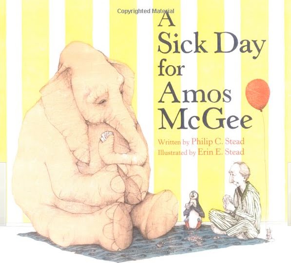
Caldecott winners announced

Today the American Library Association announced this year's winners of the Randoph Caldecott Medal for the most distinguished American picture book for children.

Drumroll .....................


Erin Stead, Illustrator
Philip Christian Stead, Author
a Neal Porter Book, published by Roaring Brook Press, a division of Holtzbrinck Publishing

Congratulations!!!!
(Erin seems to only have a blog, not a website.)


Bryan Collier, illustrator
Laban Carrick Hill, Author
published by Little, Brown and Company, a division of Hachette Book Group, Inc.


David Ezra Stein, author and illustrator
published by Candlewick Press

There were also several additional awards given for literature. To read the full list, please go here.

Friday, January 07, 2011

Sardine Valentine


A little early, but I needed to get it done so I can make some cards and what not.
I had thought about doing watercolors for this, but went back to my default setting - colored pencils. Its all Prismacolors on Stonehenge paper.

I think someone should really make heart shaped sardine cans, don't you?

Monday, January 03, 2011

So you wanna be a ...

These are too funny! And spot-on, both of them.

This first one is verbatim what we illustrators get from well-meaning children's book writer/illustrator wannabes, all the time. Bless them.


And this one is about someone from the same gene pool, except she wants to be an architect. I studied architecture before I switched over to illustration, so can attest to the accuracy of this one too. (Although I got out while I was still in the 'drafting stairs' phase, long before the 'smoking two packs a day and living in a box by the freeway' stage. Thankfully.)

Friday, December 31, 2010

Colored pencil swatches


I went on a swatching bender and (finally) made color swatches of almost all my colored pencils. (Everything but the Polychromos, which I know really really well and didn't feel the need to swatch. And also, I just ran out of gas.)

*This isn't meant to be an 'official review' of any of these brands, by any means. More like just an impression by ONE user. For example, I love love love Polychromos, and I know plenty of people who can't stand them, so take what I say here with a grain of salt. Its all subjective, you know?*

First up, the Luminance. These are light fast, which means they won't fade like a lot of other colored pencils will. (Or at least not as much.) They're also expen$ive.


I was at first really disappointed because many of the set of 76 were scratchy going down. I went so far as to email the company as well as the online store I bought them from to ask for a refund or something.

Then I sat down to do another quick scribbly swatch chart to document which ones were really bad - and this time, they worked better.


I think its possible they were actually a bit frozen? from sitting on a FedEx truck the first time around, since I had opened them up almost immediately upon receiving them and did the first round of swatches right away. This second set was made a few days later after they've been sitting in a nice warm house, so maybe that's made a difference. I'm willing to give them another chance.
(And I emailed both companies back to set things right.)

However. Aside from that (let's say they all 'went down' smooth and I was 100% happy with that aspect), I have a couple of picky complaints:

The name of the color is wrapped around the barrel of the pencil (instead of going down lengthwise, like with most other brands) which means you have to turn the pencil around to read the name. I know that sounds like I'm just being lazy, but its kind of annoying. I understand why they did that - to keep the color name from being sharpened off as the pencil gets sharpened down to the nub. OK.
But more annoying than the wrap-around design is the color of the type - its reflective silver, and almost impossible to read, especially when one has a light on over the drawing table. At least for me.

So you can picture this - I'm cranky because the pencils are going down scratchy, then I can't read the darned name on the end. And I'm thinking about how expensive these are, and how much I was looking forward to them, and how I was expecting them to be pencil nirvana. Well, I don't want to give them a bad review, but I can't in good conscience give them a glowing one either. I would LOVE to hear anyone else's thoughts on these in the comments or you may email me privately.

On a good note, they do come already sharpened, and they feel nice to hold, and the color range is fine. And they're light fast, so there you go.


Next up I did my Lyra Rembrandt Polycolors.


Ahhhh, such smooth luscious feeling pencils. And such pretty colors. I did use these a while back on a piece and ended up using my Polychromos to bump up some color at the end. But now I think that if you give them a good burnish, the colors will pop more. I tend to not like to burnish - I'm not a fan of the 'look' (usually, but there are exceptions - and I'm just talking about for my own work, I'm not criticizing anyone else's burnishing technique), and I really really don't like how it makes my hand and arm feel. But over all, the Lyras go down 'like buttah'.


Then I did my whole set of 132 Prismacolors.


It was about time - I've been using an old set forever, that was actually bits and pieces of lots of sets cobbled together, then recently sprung for the new ones. I've used several of these, but also there were many that hadn't even been sharpened!! (That's one drawback of Prismas - you have to sharpen them all.)

Then after I was done I realized I'd done Terra Cotta twice (which means I had a new and an old one in the tin) and also included a Deco Blue, which I know wasn't in the new set, since they're not doing the Deco colors anymore.

Still, it was good to do, because there are some neat colors I hadn't used. There a lot of good sort of neutral beige-y colors like Rosy Beige, Peach Beige, Ginger Root, Putty Beige and Beige Sienna. I also like Espresso and Chocolate (well, no surprise there). And the tried and true French Greys are essential, as are (for me, anyway) Black Raspberry, Black Grape and Black Cherry.


Then I did the Coloursofts.


I have no complaints about them at all. They go down easy and have a nice color range.

I don't have my current Lightfast booklet from CPSA nearby, so can't comment on that aspect of any these pencils at the moment. I know that's their biggest drawback, that some of them fade.

I'm glad I did these swatches - now I know what I have, and how they feel, and have them there on a chart I can hold up to see without having to fish through the tins for a color. Sometimes you need a really specific color for something, and when you have literally hundreds of pencils, it can be hard to find the right one.

So that's it. Now I have to go make some actual art.

Good news

My reindeer making shortbread won a little award.
Third place in the They Draw and Cook's holiday recipe contest. I'm happy!


Nate and Salli (who are totally cool) put it on the TDAC blog ~


Then it was also featured on the Food Network's blog ~


Thank you Food Network people and Weldon Owen Publishing people for judging my little reindeer making shortbread to be worthy. They and I are both very proud of ourselves!!

Want to know something? This whole 'digital thing' is pretty new to me (which you know if you've been reading my blog a while). I don't really 'do' digital. Until recently. When I started fiddling with my Wacom and Photoshop, I knew I didn't want to try to replicate a super realistic style - and just do it digitally instead of with traditional media. I figured out pretty fast the best way to go for me was to do something completely different. And that's when I started to have fun!

Sometimes I still start out with a pen and ink drawing, then scan it in and fiddle with it and color it with Photoshop. Sometimes I do the whole thing digitally.

I put a little demo of how I put together the reindeer piece here on my site.

This was a nice way to ring out the old year and ring in the new one. I hope this new year is a really good one for everyone, full of good health, good cheer, and good work.

HAPPY NEW YEAR!!